CULTURAL PERSPECTIVES
Empowering users with
inclusive information
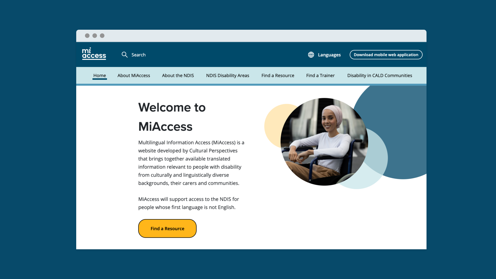
Cultural Perspectives was looking to create a disability resource hub for culturally and linguistically diverse communities. The hub was to be called 'MiAccess: Multilingual Information Access' and would house translated resources available for download. The website was to be designed with accessibility compliancy.
Approach
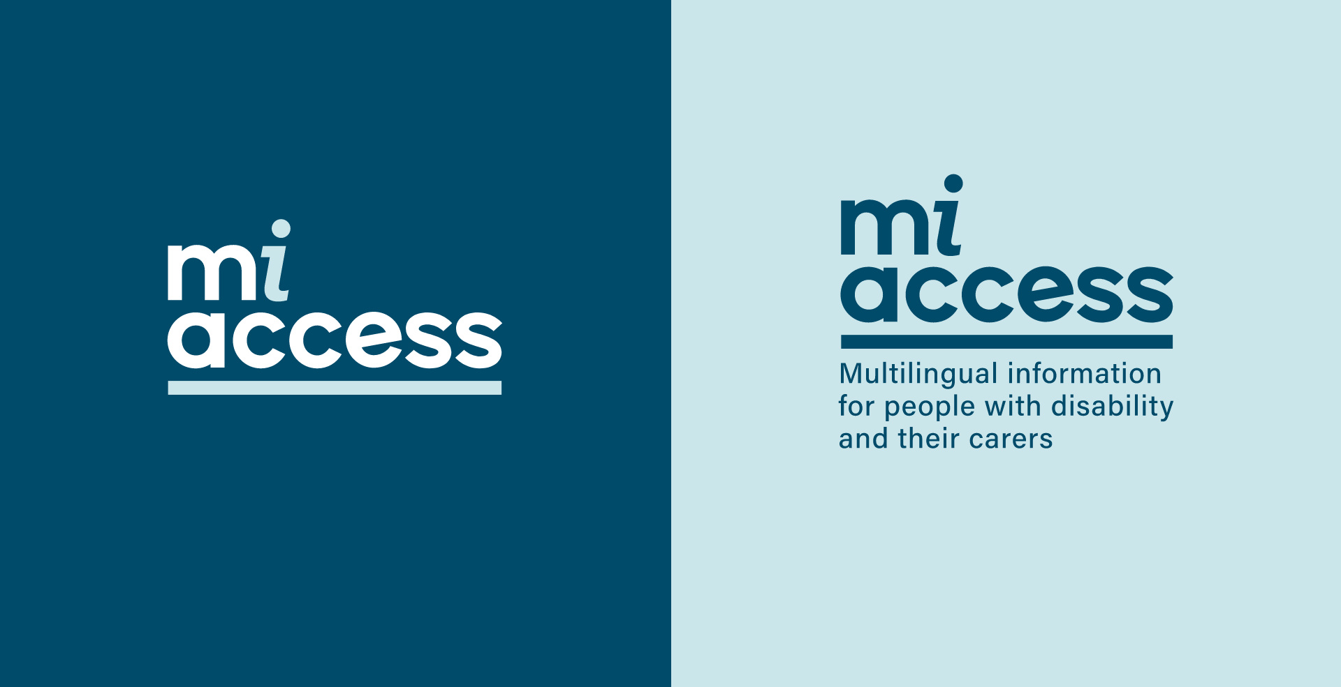
The brandmark was designed in line with the strategic direction of “accessible information”. A rounded typeface talks to the openness and inclusivity of the resource hub while lowercase letters feel approachable and inclusive. An 'i symbol, synonymous with 'information' was chosen to create an immediate visual cue of recognition for viewers. A line positioned under the logotype forms a foundation and a platform, to represent the lifting up and empowerment of users with this new access to knowledge, while also serving as a dividing element in the secondary logo. An accessible, welcoming colour palette conveys trust and knowledge and is used across the website to clearly define sections and features to users.
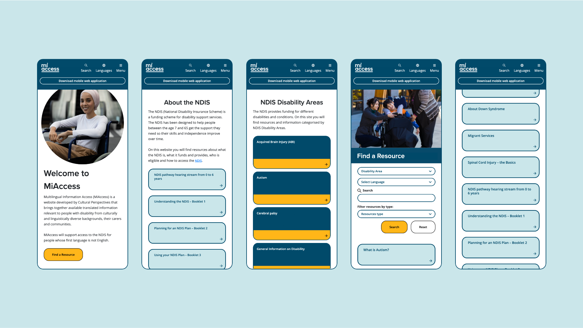
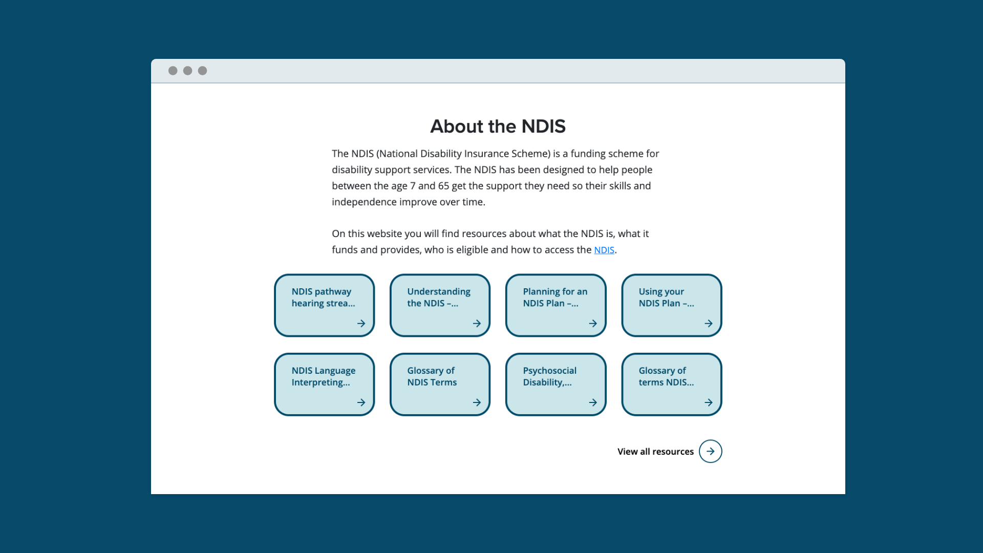
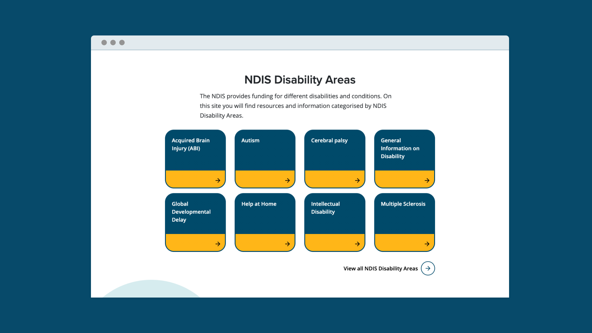
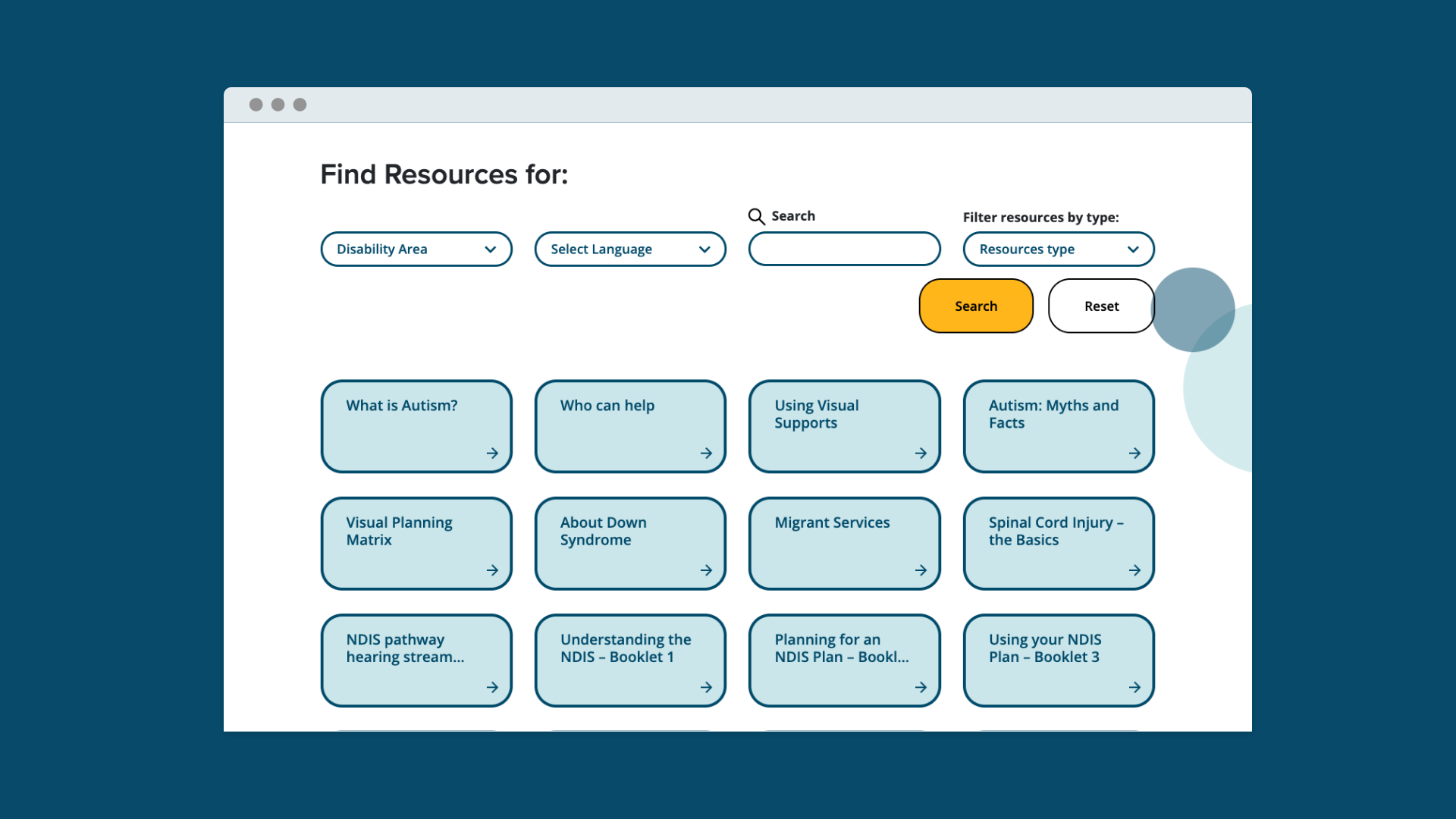
The website was designed to WCAG AA standards, working in multiple languages and appropriate for multiple audiences. We designed variations for right to left languages such as Arabic and a downloadable web application for easy access. The website was reviewed and verified by an accessibility agency to ensure compliancy across all facets.
The result is a considered, accessible resource hub of information for culturally and linguistically diverse communities.
Services
Logo design
Website design
Art direction
Project credits
Agency: Principle Co
We acknowledge the Traditional Owners of Country throughout Australia. We live and work on Wurundjeri country and pay our respects to Elders past, present and emerging.