MORGAN&CO
Translating lived experience
into expertise
A lived experience consultant was looking to align her brand to communicate the maturity of her practice to both practitioners and high-level changemakers while representing her unique approach to the work.
Approach
After a series of brand clarity workshops with founder Morgan, it became clear the brand would need to strike a balance of personable and credible and would include a new name, a new logo and visual identity and a defined tone of voice.
The name 'morgan&co' was chosen to reflect the collaborative nature of the work and recognition that this work cannot be done alone. Whether it is with peers or with clients, knowledge and expertise must be shared for systems change to occur. The concept of 'let's do it together' informed the design of the logo and the direction of the visual identity.
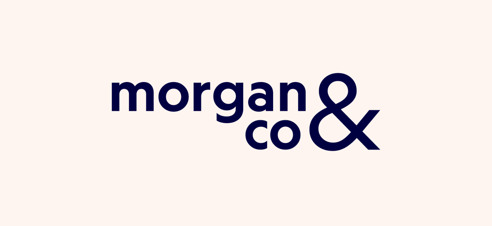
The logo represents collaboration as a catalyst for change with a large scale ampersand symbolising amplified impact through sharing of expertise and learned knowledge. Here the ampersand acts as a bridge and symbol for collaboration, a key principle of morgan&co. Similar to Morgan's approach, the logo's typeface has irregular features that are unexpected and a bit quirky.
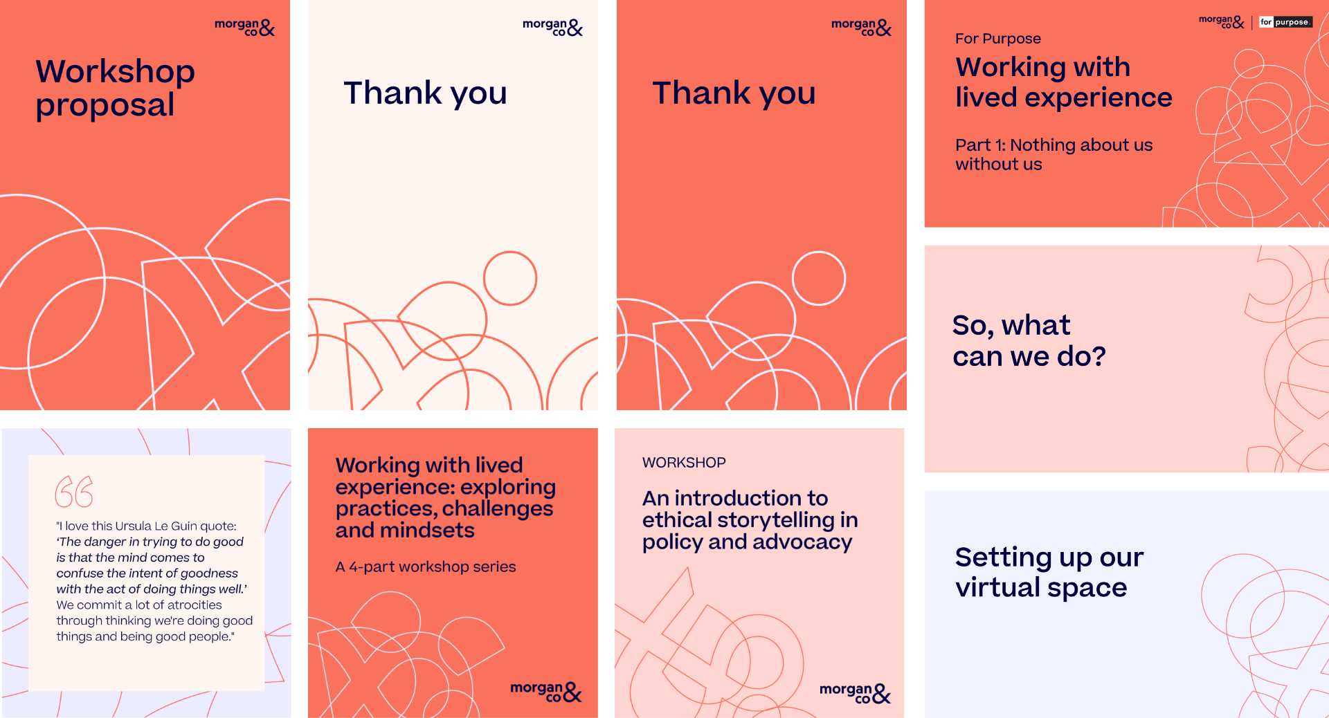
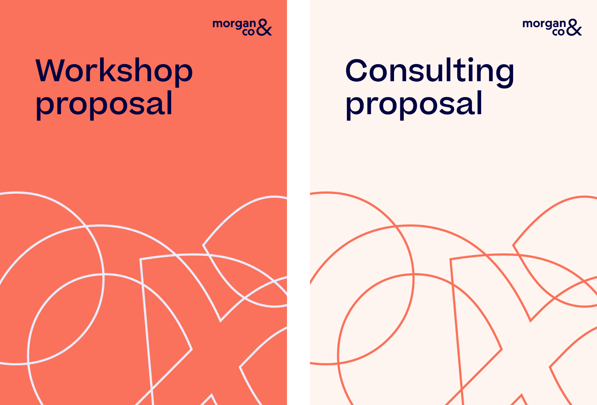
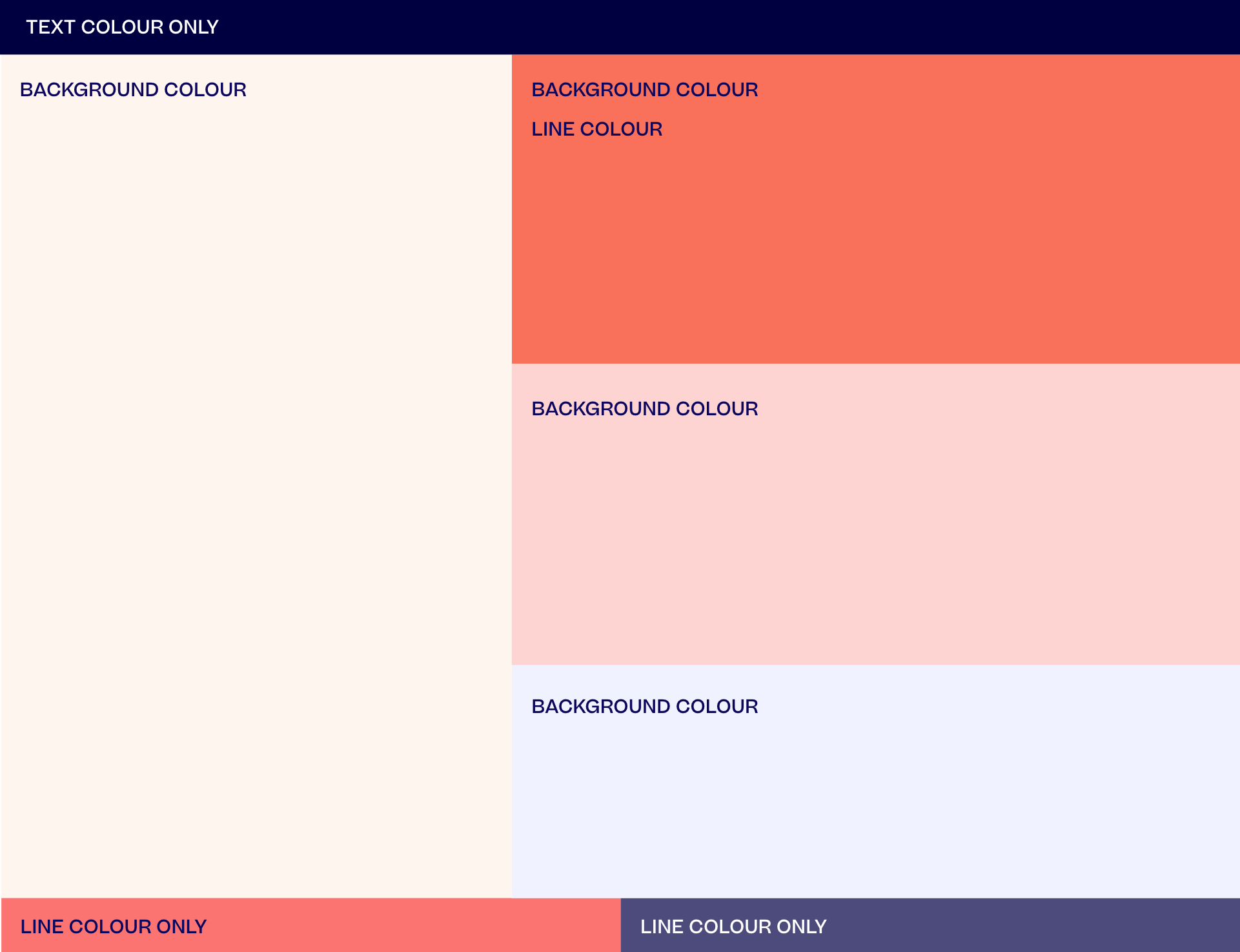
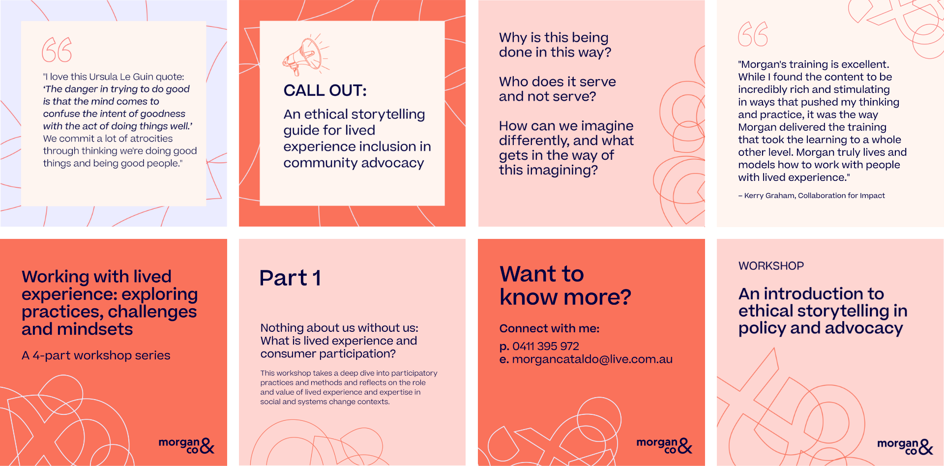
The brand pattern developed from elements of each part of the logo is a series of overlapping shapes representing the iterative and everchanging nature of the work. The organisation of the shapes symbolise Morgan's ability to hold space while navigating complex topics. The brand system is supported by a palette made up of bold colours and tints which provide the base for the expressive brand typography.
The brand was expressed across business collateral, workshop collateral and marketing collateral and website assets. A brand guideline provided clear guidance on how to express the brand across further touchpoints with consistency and maximum impact.
Working in collaboration with a copywriter, we devised the brand's verbal identity which included brand values, a positioning statement, key messaging and a tone of voice.
The result and impact to Morgan's business was an aligned brand that represented her authentically and gave her clarity and confidence in communicating the value she brings.
Services
Brand naming
Brand strategy
Brand identity
Collateral design
Creative strategy
Project credits
Copywriter: Emma McMillan


We acknowledge the Traditional Owners of Country throughout Australia. We live and work on Wurundjeri country and pay our respects to Elders past, present and emerging.